What your visitors see a stand in 10 seconds
05/02/2026
And why are these first few seconds crucial at a trade show?
At a trade show, everything moves very fast.
Visitors walk down the aisles, observe, scan… and decide in a few seconds whether or not to stop at a booth.
Need a fill-in-the-blank checklist to make sure your exhibition stand project checks all the boxes? Document to claim or download in this article.

Even before a word is spoken, before any demonstration or contact, your booth is already sending out a multitude of signals: readability, credibility, brand positioning, accessibility, energy.
In reality, a visitor forms their first impression of your booth in less than 10 seconds.
And this impression often dictates what happens next – or what doesn’t.
At an exhibition, visitors don't “look”; they scan. This scan is quick, instinctive, almost unconscious.
This is why the readability of a stand has become a central issue at trade shows.
Charline Prunier
Founder of WENES Group
Founder of WENES Group

Why the first 10 seconds condition everything
These first few seconds play a decisive role, as they influence three key elements.
- Immediate credibility
A readable, structured, and coherent booth projects a professional and reassuring image.
Conversely, a confusing booth can — often wrongly — give the impression of a vague or poorly managed offering.
- The decision to stop
The visitor doesn't say “I will never go.” He says instead: «I'll see later».
In the reality of a living room, this “later” almost never happens.
- The quality of the upcoming exchange
Even when the visitor stops, their first impression influences the posture of the exchange: curiosity, confidence, distance, or mere politeness.
These 10 seconds are therefore not for convincing, but for open the door to exchange.
Readability ≠ design: a common confusion
A stand can be very aesthetically pleasing... and yet not very effective.
Readability does not solely rely on:
- the quality of the design,
- the level of finish,
- or the means employed.
It mainly depends on:
- message prioritization,
- the clarity of the entrance,
- immediate understanding of the offer,
- space travel,
- team posture and visibility.
A very well-designed stand, but one that tries to say too much, can become illegible.
Conversely, a more restrained but well-structured booth can be extremely effective.
A good stand doesn't try to tell everything.
The Say the essential, clearly, at the right time.
What the visitor actually perceives when arriving at your booth
In a few seconds, a visitor picks up on far more than one might imagine:
- your main message (or lack thereof),
- ease of access to the stand,
- understanding your offer,
- the general atmosphere (open, closed, dynamic, confused),
- the apparent availability of the teams,
- the consistency between the visual discourse and your positioning.
These signals are not analyzed rationally; they are felt.
And it's this overall perception that makes you want to stop—or not.
How to improve the readability of a stand without redoing everything
Good news: improving a stand's readability doesn't necessarily mean starting from scratch.
In many cases, it's more about:
- simplify visible messages,
- clarify priorities,
- reposition some elements,
- rework the circulation,
- align the design with the actual purpose of the living room.
👉 Readability is above all a Methodological question and external perspective, more than a question of means.
Concrete examples: what the visitor perceives in 10 seconds
To illustrate this notion of readability concretely, here are three projects carried out by WENES Stand.
Three different brand universes, three distinct contexts, but the same objective: to be understood immediately.
Honda - Readability Through Brand Strength
What the visitor understands in a few seconds:
This is a strong brand, immediately identifiable, with a clear and well-defined universe.
On this Honda stand, readability relies on:
- an instantly recognizable visual identity,
- Product signage with a clear, uncluttered message,
- space organization that allows products to breathe.
The visitor instantly understands What is the brand, seamlessly, and can then focus on the experience and exchange.
To remember:
A strong brand doesn't need to say too much. Readability often comes from restraint.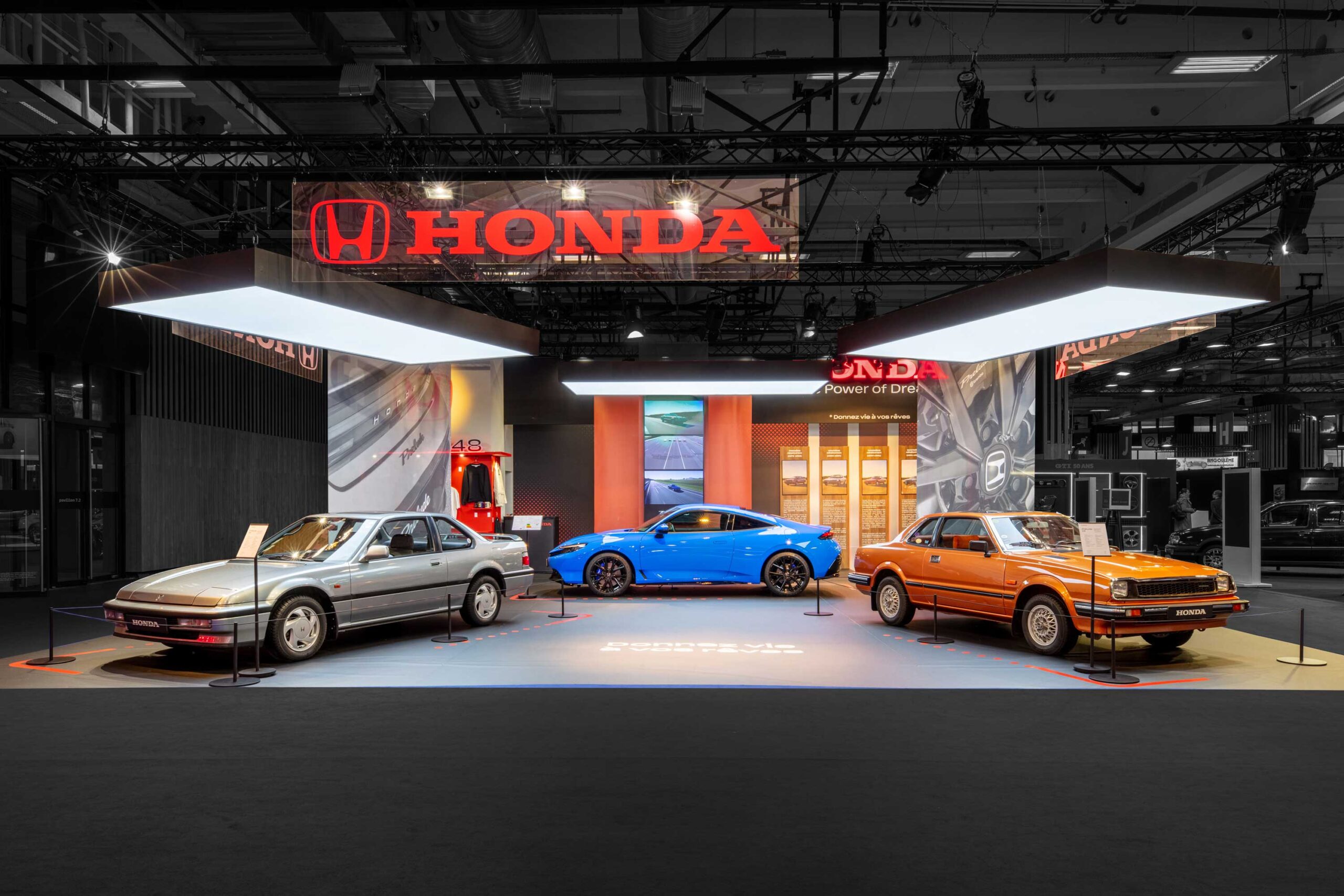
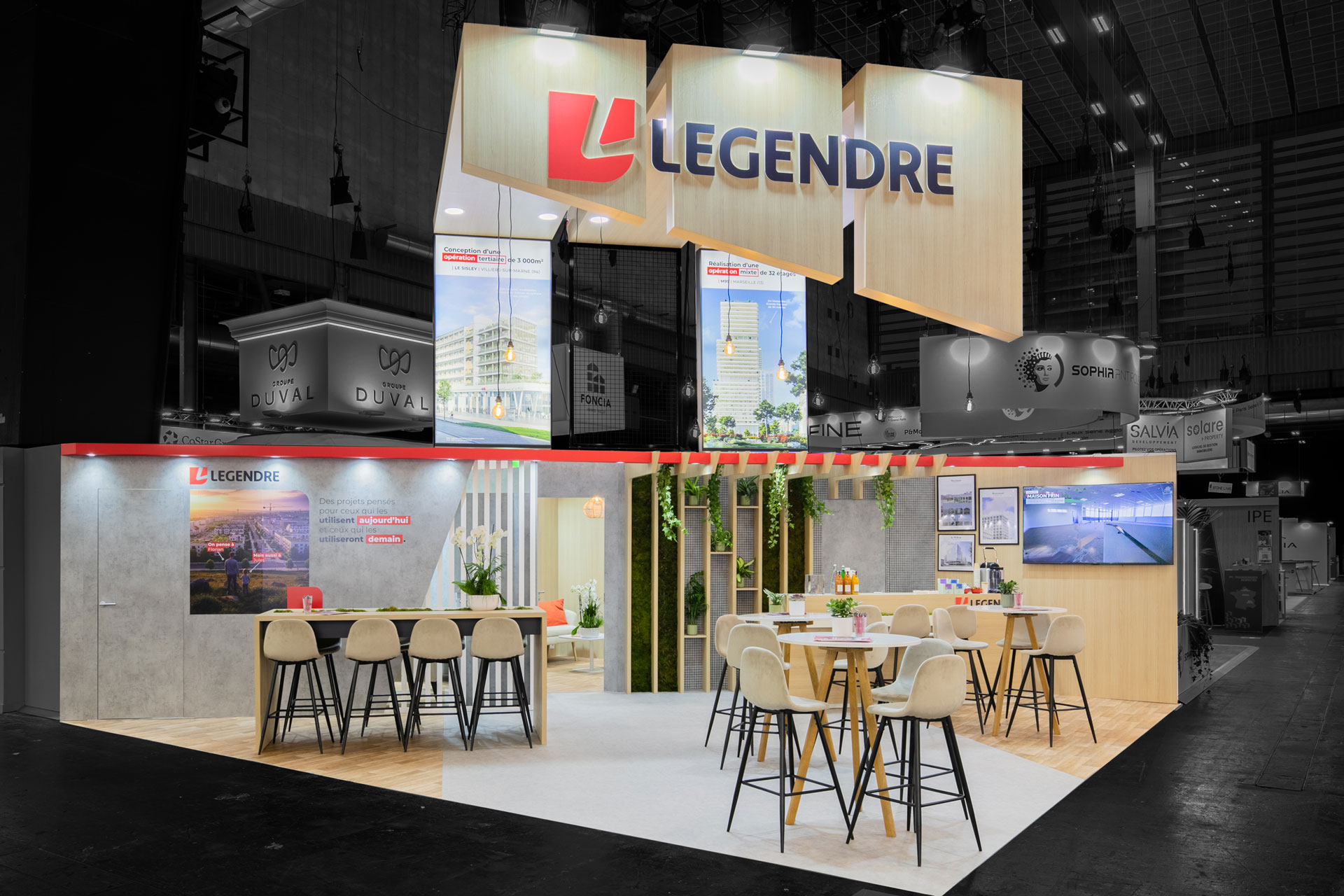
Groupe Legendre — Readability Through Architecture
What the visitor immediately perceives:
A structured, serious, and professional stand, reflecting the image of a solid group.
For the Legendre Group, readability relies on:
- a clear and readable architecture,
- volumes that naturally hierarchize spaces,
- an open circulation that invites you in.
👉 Even before identifying the details of the offer, the visitor perceives a Posture of credibility and mastery.
To remember:
The readability of a booth also comes from what the architecture says about the company.
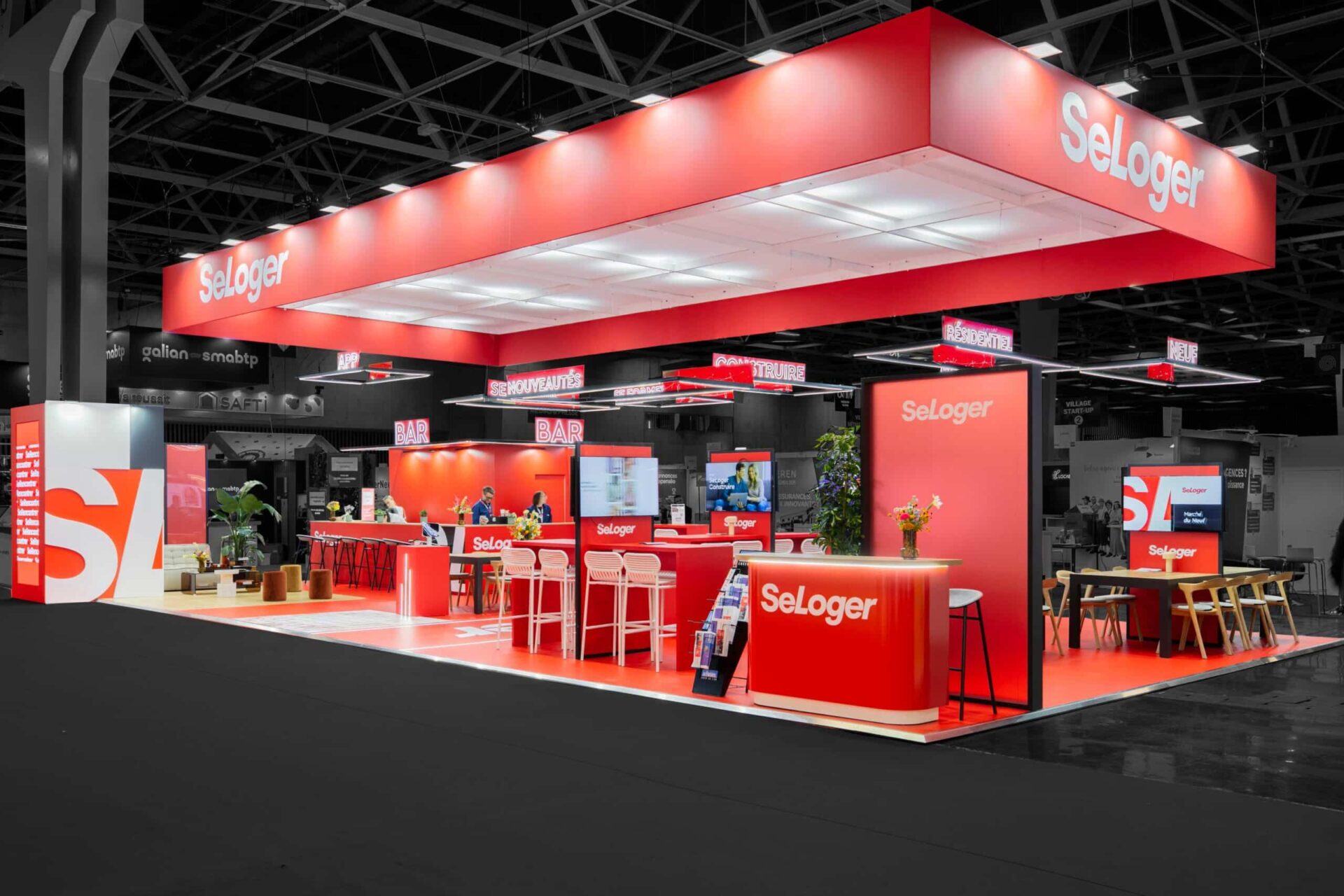
SeLoger — Readability through integrated digital
What the visitor quickly understands:
It is facing a digital, expert, accessible, and service-oriented brand.
At the SeLoger stand, readability is enhanced by:
- an integrated digital with sobriety, at the heart of the structure,
- a clear prioritization of visible messages upon arrival,
- immediately identifiable exchange areas.
The digital aspect supports the demonstration without overshadowing the human connection, which facilitates the initial contact.
To remember:
A readable stand is often a stand that naturally guide the visitor toward exchange.
From these concrete cases to a reading method
These three projects have very different universes.
However, they all adhere to the same fundamentals of readability.
In each case, we find:
- an immediately understandable message,
- a clear and welcoming entrance,
- smooth traffic,
- identifiable exchange zones,
- Visible and accessible teams.
These are precisely the criteria we use daily to design and analyze a booth.
To formalize them and apply them to your own project, we have grouped these points into a Checklist: “Booth Readability in 10 Seconds”, ready to use.
Why an outside perspective changes everything
When designing your own booth, it's difficult to step back and get perspective.
We know their offering, their message, their products... and we often assume that this is obvious to everyone.
An outside perspective allows you to:
- confronting intention with actual perception,
- identify invisible friction points,
- prioritize what really matters to the visitor.
This is often where the difference between a “pretty” booth and a truly effective booth is made.
Conclusion: Readability, the primary lever of exhibit effectiveness
At a trade show, It all starts with readability.
Before the exchange, before the demonstration, before the business relationship.
A readable stand
- attire more naturally,
- Reassure faster.,
- facilitate the exchange,
- reinforces brand credibility.
In just a few seconds, it can make all the difference.